Why I chose Assembled
I chose do do this section of work as i feel that it will be aesthetically pleasing as i can coordinate the colours and make the images and organisation of them different and my own. I feel that i have a lot of ideas for this work and can fully develop my shoots to a high standard to show my capability of the topic.
Phillip Karlburg
Phillip Karlburg is a still life and interior photographer from Sweden and is one of the most talented in the country he transforms still life into a mystery making the viewer curious and wanting to see more of his images. His work is very organised and well planned out and is very pleasing to look at going very well with my aesthetically pleasing theme.


|
I think that this image is really effective as the high contrast sharp lines and how it quickly differentiates between the fruit associated with its colour.
I feel that this image is really pleasing to the eye because of the composition and that its presented together. |

|
I feel that this image is effective because they are different things but all have the same theme of colour and they can be associated with each other. the composition of this image is very nice as is it almost randomized to perfection.
|
Sara Cwynar
Sara Cwynar is a contemporary artist who works with photography, collage, installation and book-making. She was born in Vancouver, Canada in 1985 and currently lives and works in Brooklyn, New York.
Sara Cwynar is a contemporary artist who works with photography, collage, installation and book-making. She was born in Vancouver, Canada in 1985 and currently lives and works in Brooklyn, New York.


|
I like this image because it is very organised and presented very neatly and it makes it look like there is much more available because it is set out in a tower and not all flat on the surface. i like the back ground colour and how it is a block colour and doesnt take away from the detail of the image.
|

|
i really like this image and the other ones like it as they are monochromatic and presented together it is really pleasing to look at as it is very organised and put together well.
|
Shoot 1
Plan
For this shoot i am going to do a shoot with buttons. i am thinking of placing buttons of the same colour range into some sort of pattern underneath it a sheet of coloured paper as my back drop. I changed the white balence in some of the pictures just to experiment.
I was inspired by this image because i love the fact that everything is in the same colour so i decided to do this with the buttons because i cannot find so many things in just one colour so i done different tone and the same object.


|
My Worst
This is my worst image because you can see the exposed background of the picture. and you can see that the effect of the image is gone. I had to use manual focus with the camera which you can see in some of my images. |

|
My Best
I feel that this is my best image because the angle and composition is almost perfect and i really love that the image is slightly out of focus and i feel that is really effective. i also love how you can see the windows in the reflection. |

My Edit
In my edit I increased the contrast to brighten the colours and make the outlines of the buttons pop out more. This is a very simple edit but it looks effective because it make the picture brighter.
In my edit I increased the contrast to brighten the colours and make the outlines of the buttons pop out more. This is a very simple edit but it looks effective because it make the picture brighter.

Shoot 2
Plan
in this shoot i want to plait some thread into small plaits and hang them on lines in a row making a rainbow. i do not want the thread to be too thin and i need the 7 different colours of the rainbow in the thread.
In this shoot i was not inspired to do anything from a picture i just the great idea myself and wanted to see how it would play out i really like rainbows and how they are different colours but still work in so much harmony.


|
My Worst
This is my worst image because the camera is obstructed by my hair and i cannot get the picture that i need you can also see a flare of light in the corner which also effects the quality of the images. |

|
My Best
This picture is my best because i really like how focused the image is and how it has a small focus point. i really like how bright the image is but it isn't over exposed. the composition is also really effective because it is in rows directly across the image. my edit underneath i have decreases the brightness slightly and increased the contrast to deepen the colour and bring out the texture more. |

My Edit
In my edit i have again increased the contrast slightly but this time a decreased the brightness to get deeper more intense colours and the detail in the image is much more prominent than the original.
In my edit i have again increased the contrast slightly but this time a decreased the brightness to get deeper more intense colours and the detail in the image is much more prominent than the original.

Shoot 3
Plan
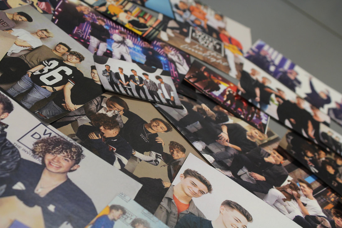
In this shoot i am going to choose pictures from online of my favorite boy band why don't we and i am going to print a lot of pictures out of different sizes and then cut them out and make a collage of different shapes and take pictures for my assembled sector.
Plan
In this shoot i am going to choose pictures from online of my favorite boy band why don't we and i am going to print a lot of pictures out of different sizes and then cut them out and make a collage of different shapes and take pictures for my assembled sector.


|
My Best
this is my best image because i really like the depth of field it is a medium depth of field. i like the fact that the images vary in size and it fades away slightly. |

|
My Worst
This is my worst image because it is extremely out of focus and i do not like the fact that you can see the background. |

My Edit
In my edit i only made some basic adjustments to shadows and contrast to intensify the image to make it more power.
In my edit i only made some basic adjustments to shadows and contrast to intensify the image to make it more power.


Evaluation
In this module i do not think that i was able to convey my ideas as much as possible and my work is pretty weak. i believe i can do better in this module but it is hard to find the ideas for specific unique shoot. i feel like i could also do more editing wise.
In this module i do not think that i was able to convey my ideas as much as possible and my work is pretty weak. i believe i can do better in this module but it is hard to find the ideas for specific unique shoot. i feel like i could also do more editing wise.
